


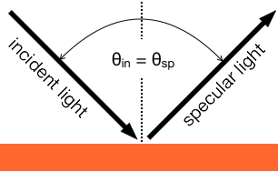
So what is going on? First let’s get clear on a definition: specular. It comes from a Latin root meaning “mirror.” So the specular light is that light being reflected like a mirror. We describe that as reflected light that is equal and opposite of the incident light. That is, the light leaves the surface at an equal and opposite angle than it is incident on the surface. We have a special name for reflected specular light: gloss. But that’s for another day.
 This distinction is important because the color of most materials is not in the specular light. So if we want to measure the color of a standard, we usually want to ignore the specular light, or at best account for it somehow. If we consider a beam of light hitting the set of orange samples, we will see that the behavior is quite different; in particular we will see that the way the light bounces off is what creates the visual (and color!) differences between the three samples. The light reflected off the low gloss sample spreads fairly uniformly across the all the angles above the surface. This shows good diffusion. The mid gloss standard reflects a higher percentage of light in the specular direction. Finally, the high gloss standard reflects a very high percentage of the light in the specular direction.


Why do we care about specular vs diffuse? Since the color information is in the diffusely reflected light, our instrument needs to measure the diffuse light in order to understand the color of the standard.
 Different instrument capture the diffuse light in different ways. Your goal should be to choose a measurement method that best aligns with how your materials will eventually be viewed. For example a common photographic setup is shown at right. The lights are positioned at about 45° and the camera is perpendicular to the subject, at 0°. It you want to measure the color of the materials and have the data correlate well with this camera setup, you should choose a 45°:0° measurement geometry. Measurement geometry is the particular arrangement of incident light, sample, and detector in a measurement system. The notation is θincident:θdetect. Note that when using 45°:0° the specular reflection heads right back at the other light, and does not get detected by the camera, or an instrument using the same arrangement.
If you will be using your materials outside, and the light source will be the sun and sky, then a 45°:0° measurement is not appropriate. This illumination is diffuse, incident on the sample from all directions. Fortunately, there are other instruments present the light in that fashion. These instruments are designated d:8°. The d indicates diffuse incident light, meaning incident from all directions. There are many more details regarding instrumentation, but again, that’s for another day.
Properties of Reflectance Standards
Most modern instruments measure the reflectance of materials, and the color is calculated from that. The detailed definition of reflectance and the methods to calculate color are beyond the scope of this article. Conceptually, reflectance is the ratio of the light that reflects off an object to the light that is incident upon the object. So something that reflects lots of blue wavelengths and absorbs the green and red wavelengths will appear blue. To calculate the specific shade of blue accurately requires a mathematical transformation from the reflectance at all the visible wavelengths to color. Ultimately many industrial applications are specified by color, so the manufacturing tolerances for many things (eg: paint, plastics, fabric) are specified in terms of this calculated color. (To stay in business, we trust that this calculation correlates well with the color our customers sees.)
 The figure shows a yellow line indicating the reflectance, yes, of a yellow material. We can see it has very low reflectance in the blue, and very high reflectance in the green and red. And green plus red makes yellow, right? (It does.)
When selecting the color range of your standards it is important to consider the color of samples you will be measuring. If you need a general purpose solution you need a complete range of colors. If you will only be measuring one color, say you are a large outdoor equipment manufacturer headquartered in Moline, IL, then you can save some money and just by a green reference standard.
There is a special class of colored standards that reflect all wavelengths equally. These will appear to be neutral in color; that is, white, black or some gray in between. (Yes, white and black are colors. Your art teacher used a different definition.) The image below shows a series of eight, but the number you need will depend on your application.

Matte or Glossy?
As introduced above, the surface properties (matte or glossy) are important aspects of reference standards. There are two main considerations with respect to the surface properties: what are the properties of your typical samples? and what are the physical conditions where you will use your standards. The first one makes good sense in from a metrological point of view; to the best of our ability, standards should be as similar to samples as can be managed practically. Meaning that is all you will ever measure is very matte blue samples, then you will get the best measurement results if your reference standards are matte and blue. Few measurement programs are so limited though, but many applications may be exclusively matte or glossy and your reference standards can reflect those qualities. (See what I did there?)
Even if you always measure matte samples, there is one consideration regarding matte reference standards: the rough matte surface can collect dirt and other contaminants. High quality reference standards can usually be cleaned, even in ways that will not affect their reflectance and color properties. But all things being equal, glossy materials are much easier to clean than matte materials.
Properties of Transmittance Standards
In addition to the description of reflectance, transmittance standards can be either scattering or non-scattering. These are sort of equivalent to matte and glossy, as you can see by the diagrams below. The scattering sample diffuse the light as is passes through, and the transmitted light is spread out in all directions. The non-scattering material does not change the direction of the light. Just like for the reflectance standards, the type of instrumentation you use should be able to handle the type of samples you intend on using.


